Title: Where people are moving - both to and from
Post by: John Raabe on March 14, 2011, 11:31:20 AM
Post by: John Raabe on March 14, 2011, 11:31:20 AM
Here is an interesting interactive map on migration from county to county within the US.
http://www.forbes.com/2010/06/04/migration-moving-wealthy-interactive-counties-map.html
 (http://www.forbes.com/2010/06/04/migration-moving-wealthy-interactive-counties-map.html)
We get a lot of inbound from S. California and northern FL.
http://www.forbes.com/2010/06/04/migration-moving-wealthy-interactive-counties-map.html
(http://www.forbes.com/2010/06/04/migration-moving-wealthy-interactive-counties-map.html)We get a lot of inbound from S. California and northern FL.
Title: Re: Where people are moving - both to and from
Post by: Squirl on March 14, 2011, 02:24:22 PM
Post by: Squirl on March 14, 2011, 02:24:22 PM
In the North East almost all the Red lines are to warmer climates. Very few black lines going to the north east. When you click on southern California there is a huge black line from the north east and red lines to almost everywhere else in the country. One of the things around here is if you click on the Poconos you can see the massive influx of people from NYC.
Title: Re: Where people are moving - both to and from
Post by: Alan Gage on December 10, 2011, 06:19:53 PM
Post by: Alan Gage on December 10, 2011, 06:19:53 PM
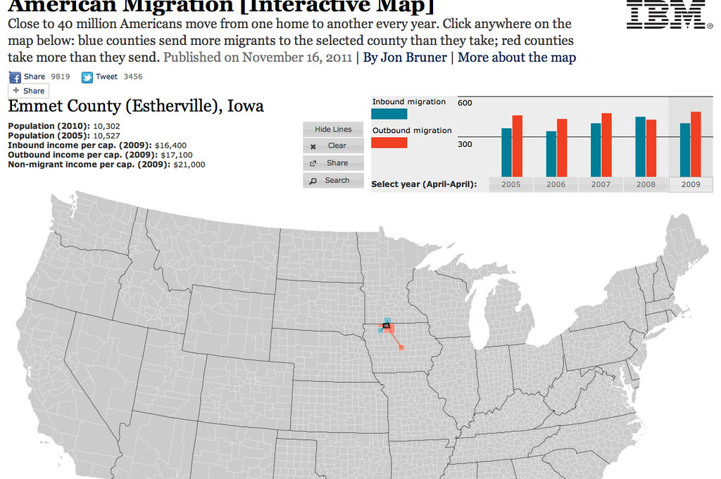
Neat. It's been updated and includes more info now.
http://www.forbes.com/special-report/2011/migration.html
Your map is much more interesting than mine:
 (http://www.flickr.com/photos/7935459@N05/6489249085/)
Where are you going? (http://www.flickr.com/photos/7935459@N05/6489249085/) by Alan Gage (http://www.flickr.com/people/7935459@N05/), on Flickr
Alan
http://www.forbes.com/special-report/2011/migration.html
Your map is much more interesting than mine:
(http://www.flickr.com/photos/7935459@N05/6489249085/)Where are you going? (http://www.flickr.com/photos/7935459@N05/6489249085/) by Alan Gage (http://www.flickr.com/people/7935459@N05/), on Flickr
Alan